TravelTea Mobile App (B2B)
The prompt's for UX Scene's Designathon consisted of:
1, Design a mobile experience for travelers.
2.Deisgn a website experience for seniors and elderly.
3, Design an experience focusing on accessibility and inclusion.
Role
Co-Lead UX Designer
Services
Visual Design
UI & UX Design
Industries
B2C, Travel
Duration
48 hrs
Research
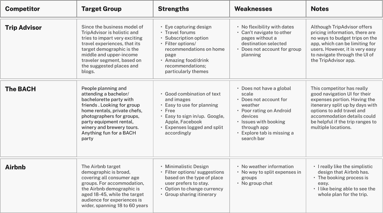
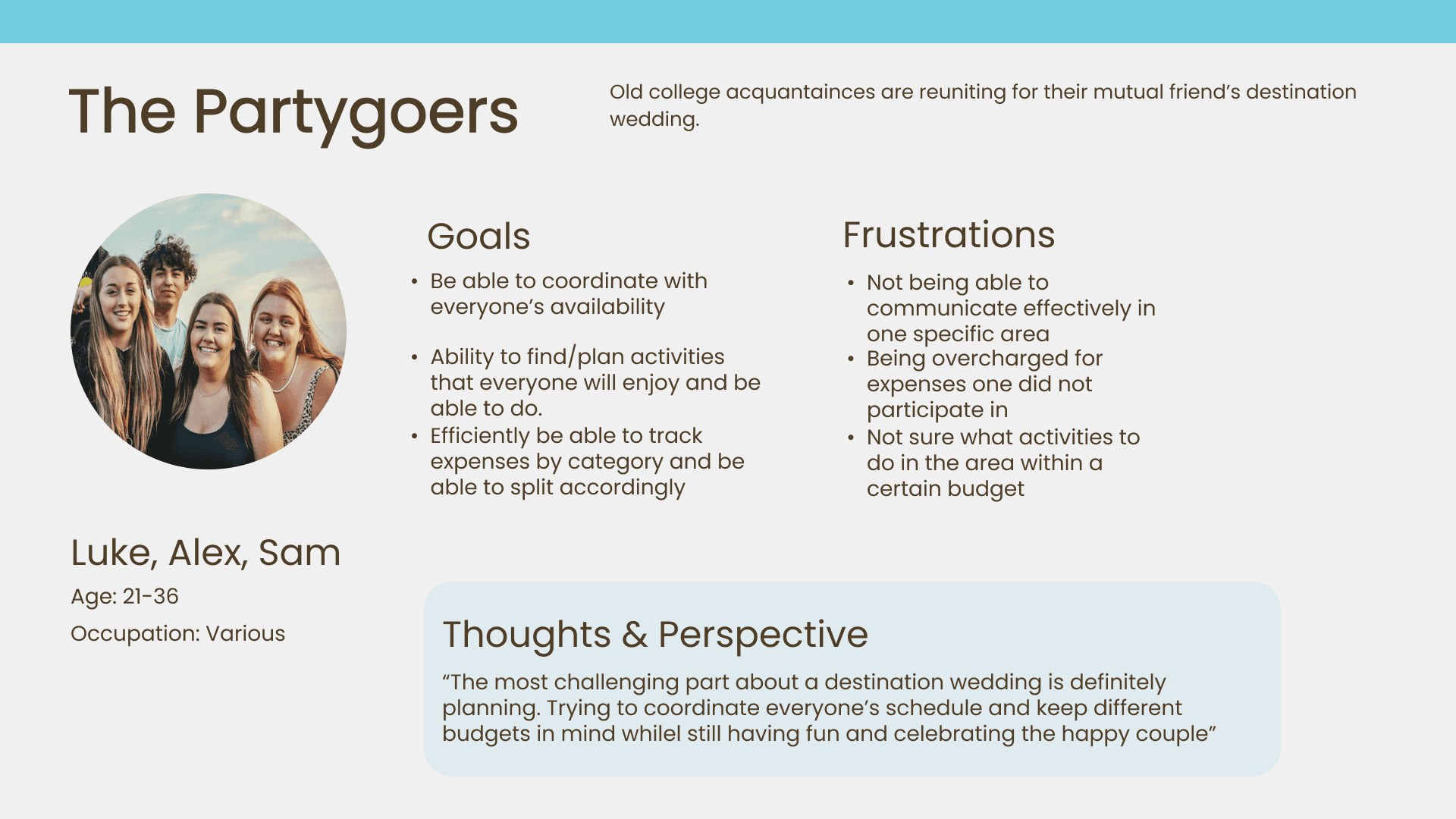
By conducting a competitive analysis, we analyzed the strengths and weaknesses of other travel apps that were popular and had the features we could improve on. This helped us determine that our product TravelTea could fill a gap in the market. Next, we moved on to affinity mapping we organized and groups notes of common occurrences or issues that occur when planning for a trip. Lastly, we synthesized that information into three personas who would plan a trip and view other itineraries for inspiration.
Ideation
We proceeded with user stories, through reorganizing stories by order of importance and empathizing with the target groups we successfully determined the most viable product (MVP).
As a user, I want to:
Have options to popular attractions so I can plan my trip
Share itineraries with my group
Split expenses.
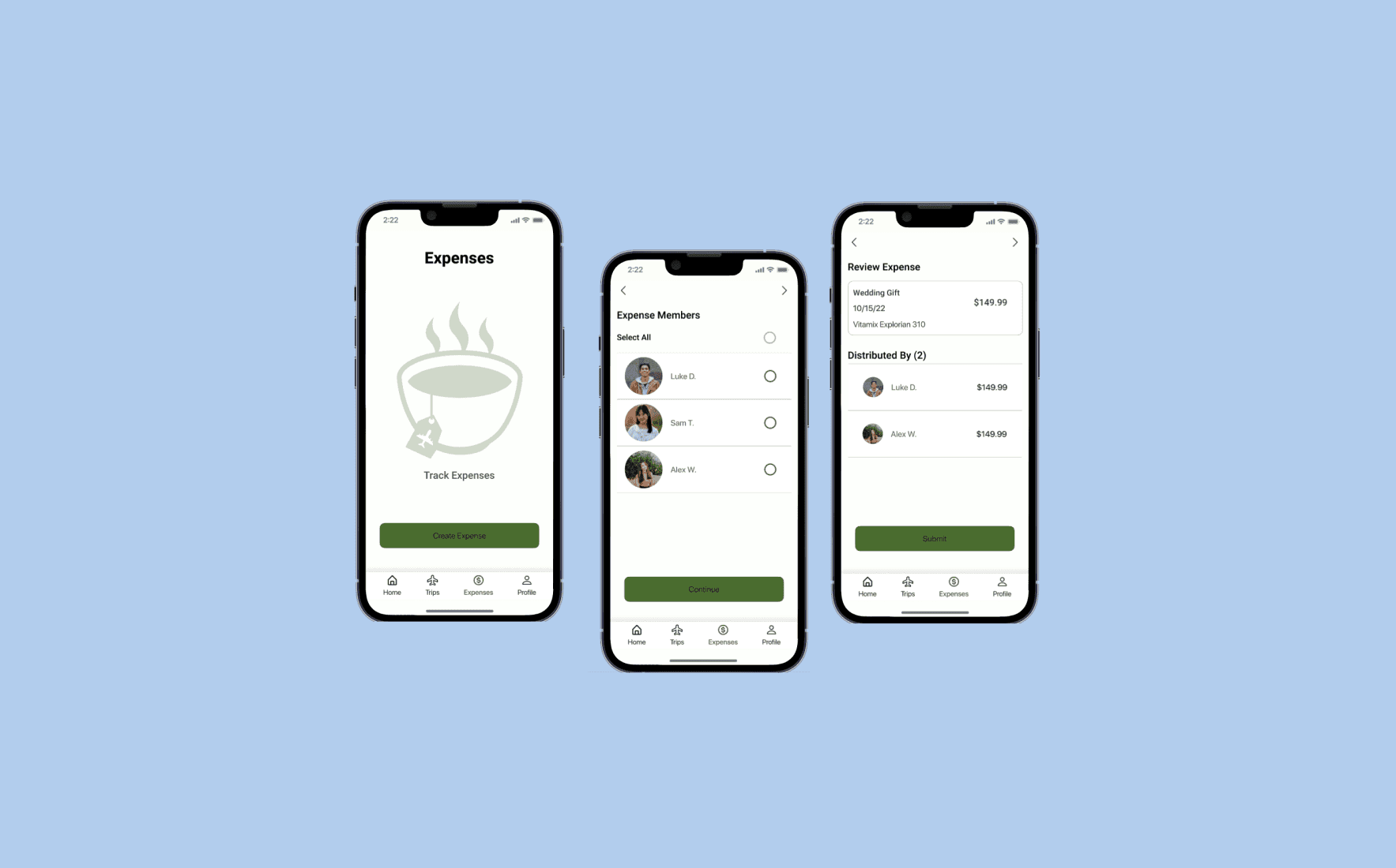
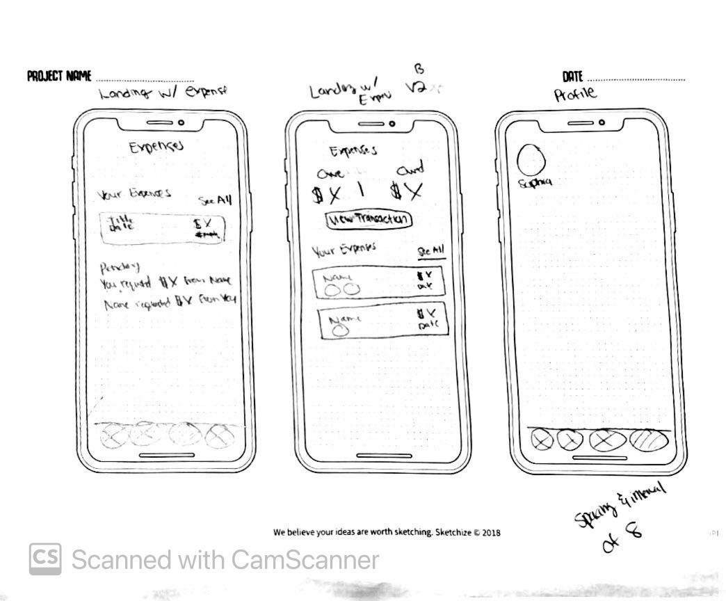
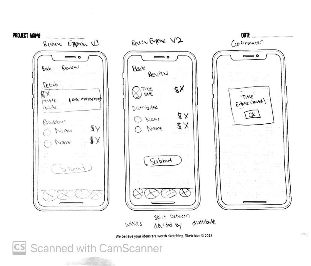
Next, we proceeded to sitemaps where we designed to layout our mobile app. After, we sketched out our design concepts. We communicated our ideas surrounding validating our design concept. This allowed us to iterate and refine our ideas quickly as our turnaround was fast approaching. I was given the responsibility to design the expense feature of the product from beginning to end
Design
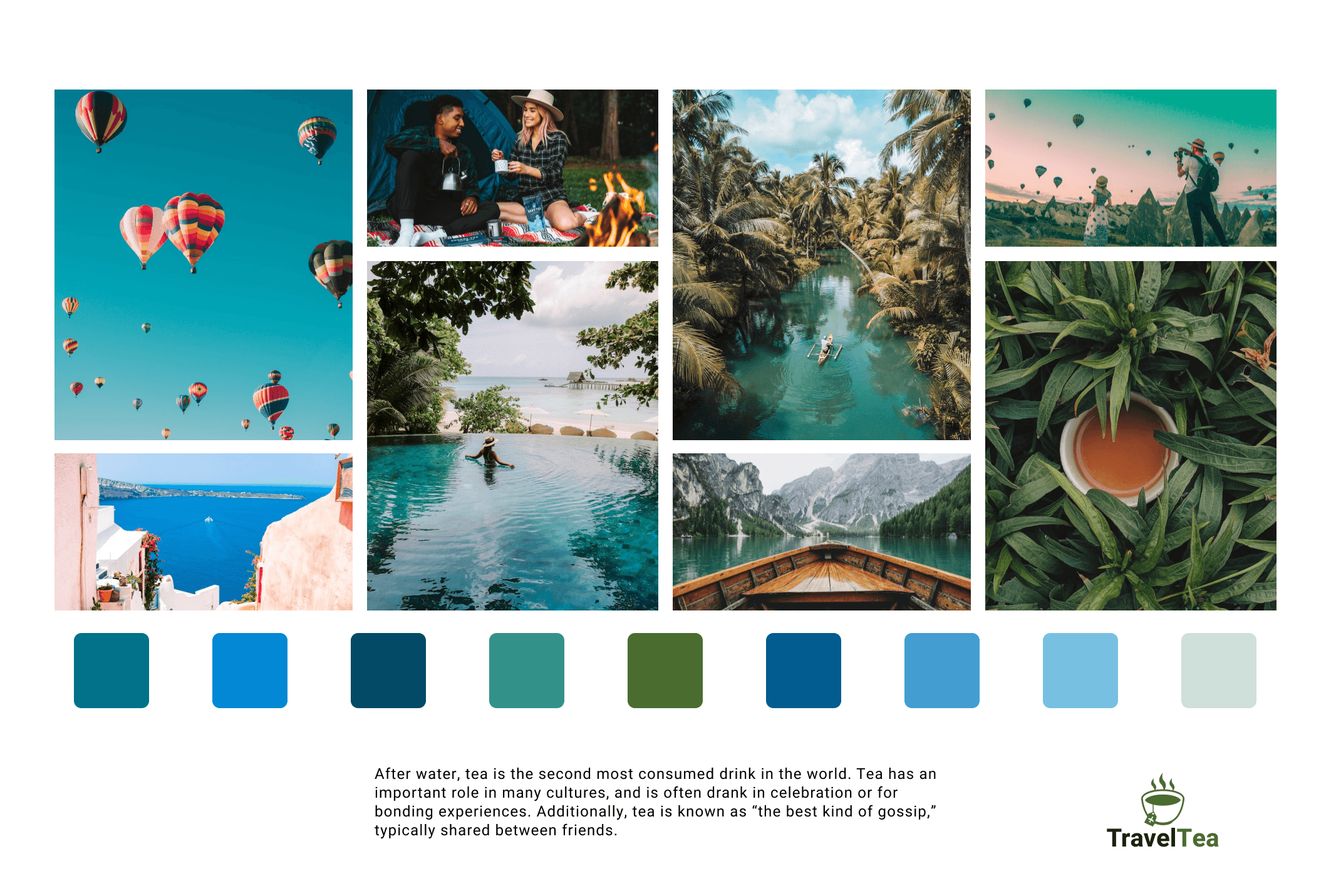
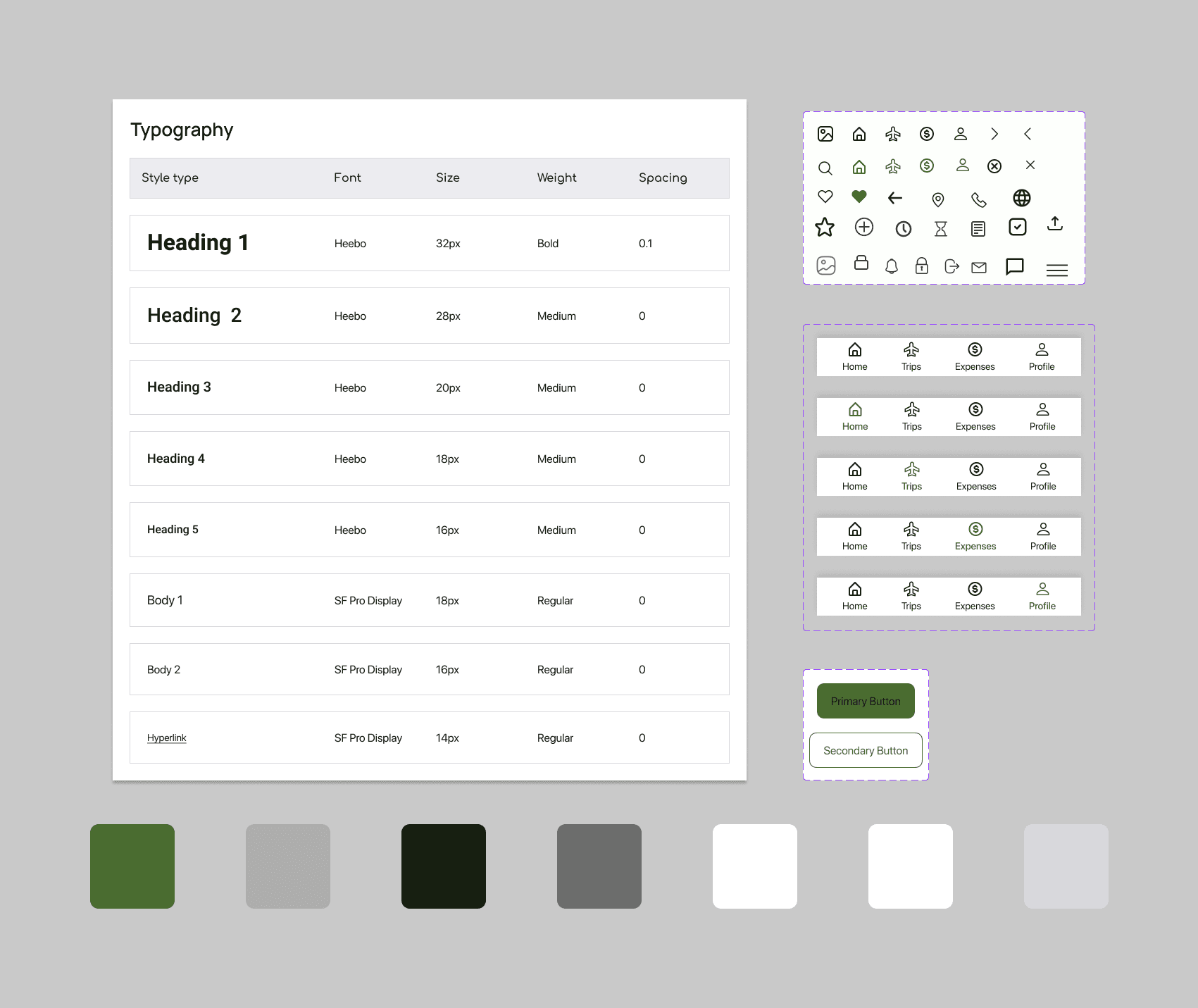
We proceeded to create a mood board to encapsulate the feeling of reliability and promote relaxation. We crafted a travel aesthetic and carefully selected shades to visualize and communicate our designs. Once that was completed, a polished style guide to ensure all of our designs were consistent was established. As time was of the essence, we moved on to high fidelity mockups. I took charge of the expenses portion of the app and ensured proper visual hierarchy and designed screens that would be intuitive for user benefitting from the expense feature in our mobile app. Finally, a prototype to truly see the functionality of TravelTea was made. However, this was not the end as it highlighted that we actually needed to include more transitional screens which we quickly refined and improved our overall design.
Reflection
This was an incredibly rewarding experience where I learned so much in such a short period of time. Due to the 48 hr time constraint, we were unable to conduct usability testing so that is an aspect I wish to test out further. This experience gave me an opportunity to build further rapport with my colleagues and collectively practice and improve our design skills in a low risk environment. We held each other accountable and worked efficiently together which translated greatly in our projects with real clients later on. Overall, I am so thrilled to have participated and gain valuable insights and broaden my design perspectives. If you'd like to check our or entry, you can do so here!
