Kanary App (SaaS)
Role
UX/UI Designer & Researcher
Services
Research Visual Design UI & UX Designer
Industries
SaaS, Healthcare
Duration
8 weeks
Proper communication is directly correlated to an organization's success. It is espeically vital for resident physicials in hospials who are typically overworked, restlessly saving patient lives. It has been reported that 80% of adverse events for patient care can be pinpointed to miscomunication. The E-Handoff system currently utilized in hospitals desperately need an update, this is where Kanary swoops in.
Discovery
In order to better understand our client, the team compiled a list of questions:
Who are the users of your software?
How would you like Kanary to be perceived in terms of design?
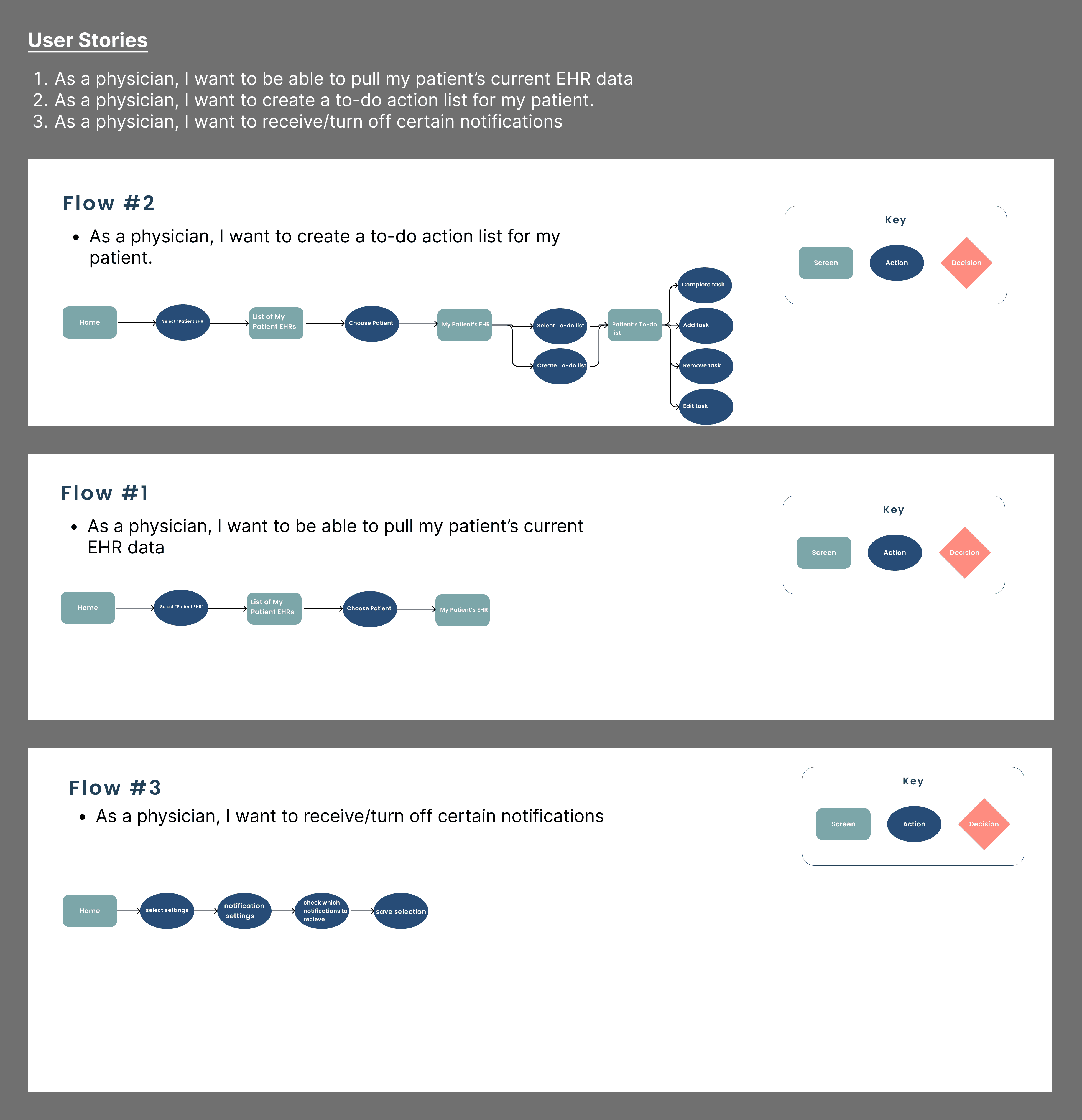
What features need to be implemented?
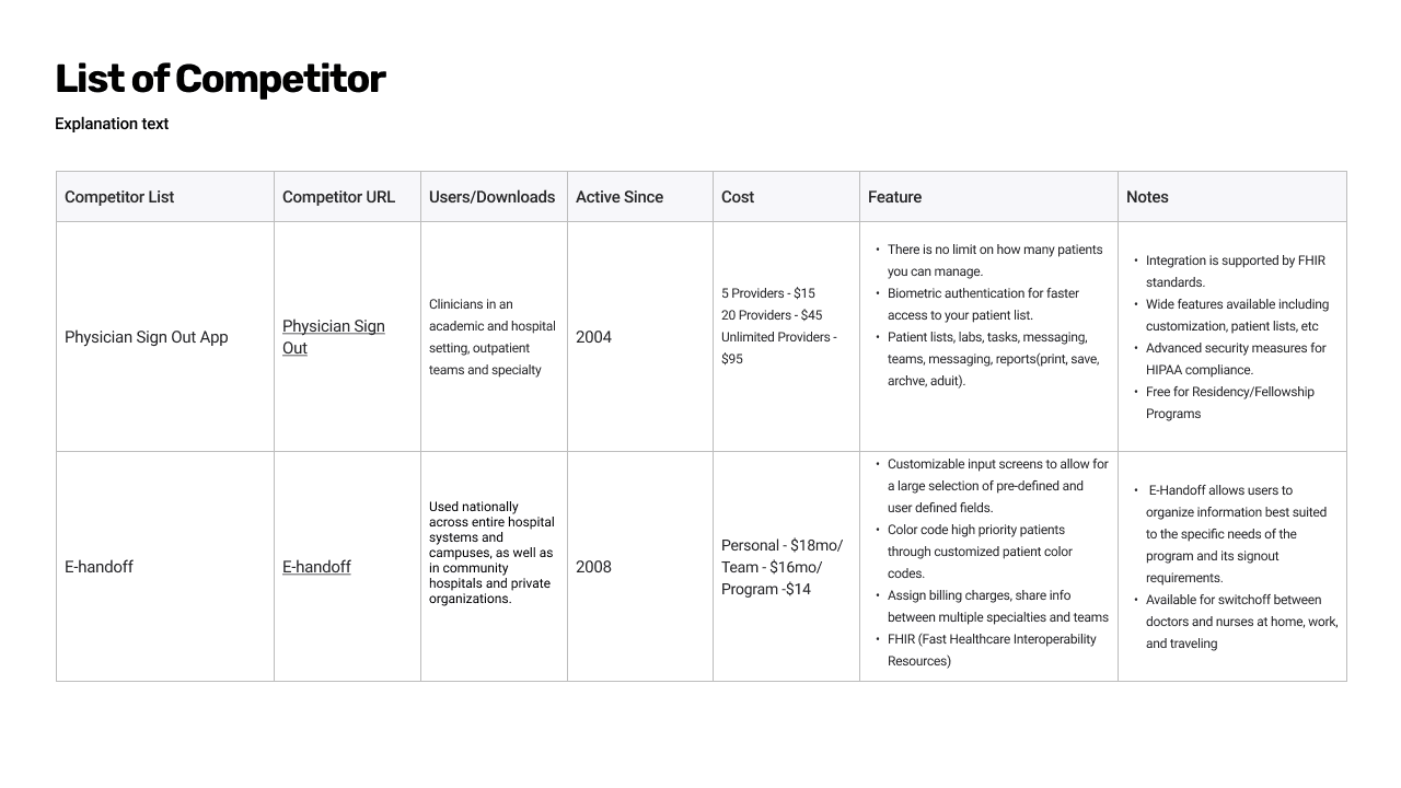
Who are your competitors and which qualities do you like/dislike about them?
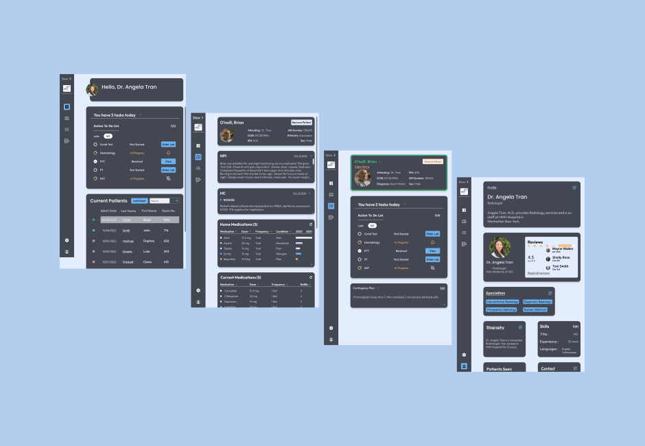
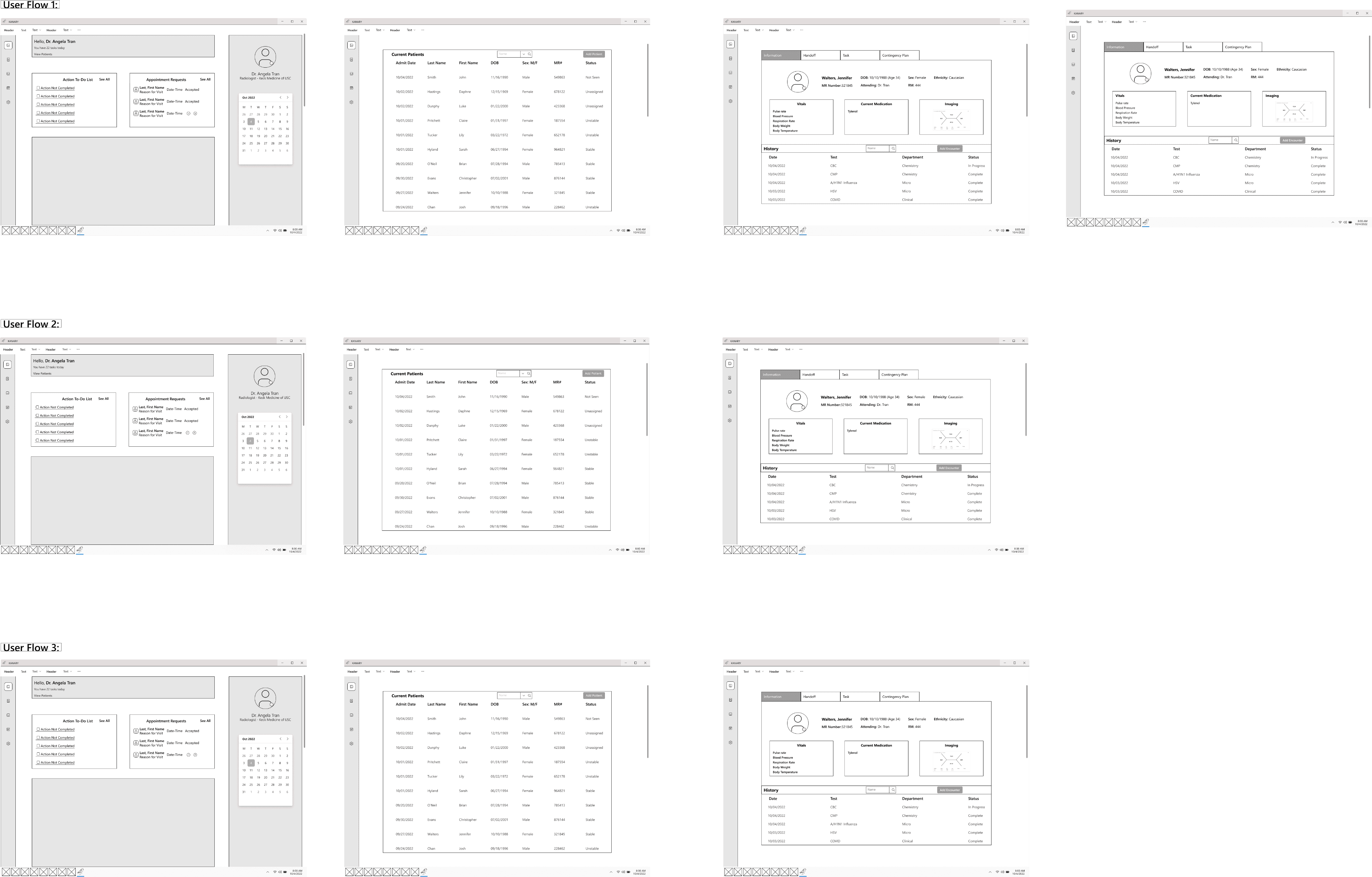
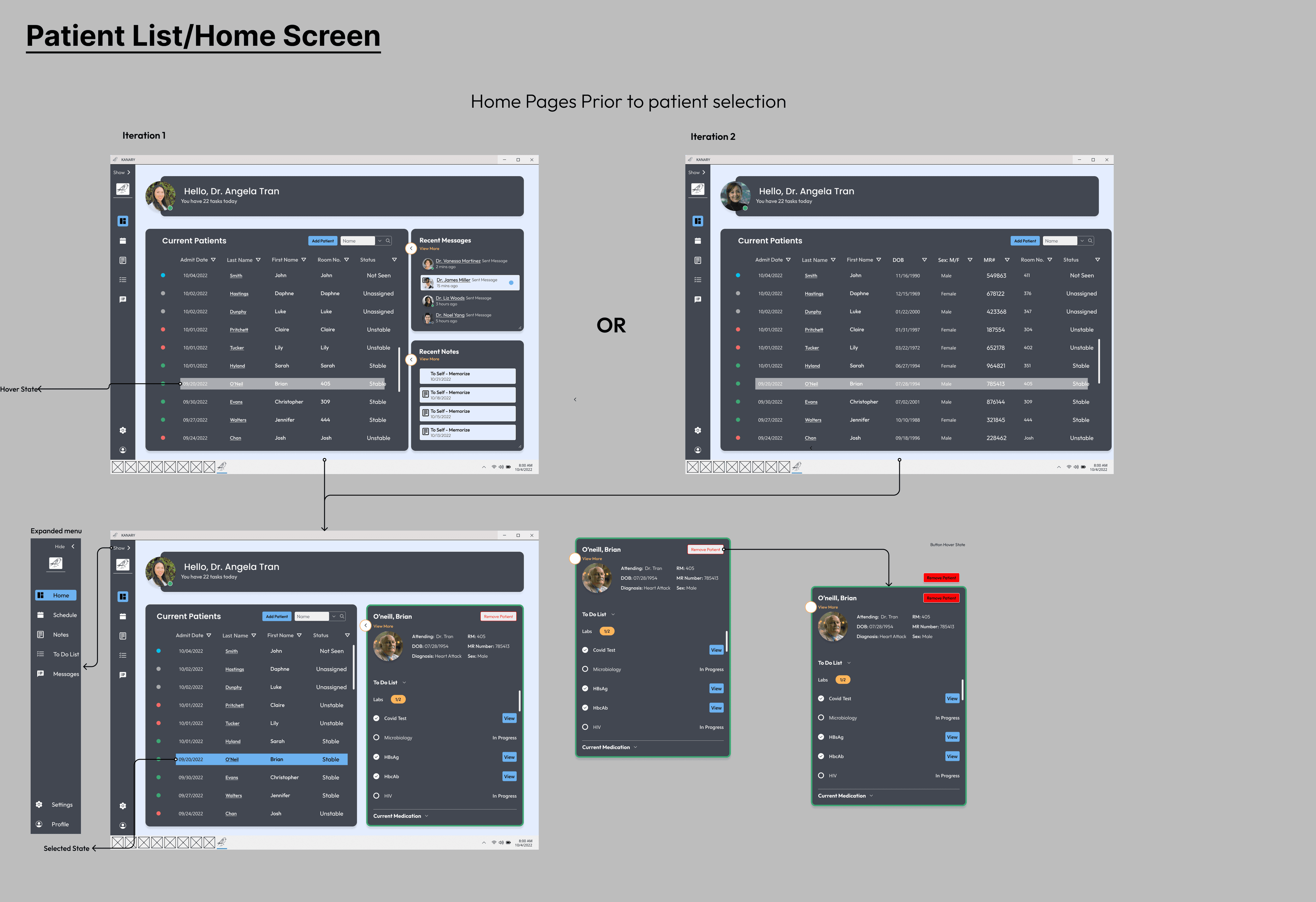
The client answered quickly so we could start our process. First, Kanary would primarily be for young resident physicians with an intuitive layout displaying patient demographics, a handoff tab, and a task manager tab with a sleek design. Their two main competitors are Physician Sign Out and E-handoff, leading us to do a competitor analysis
Design
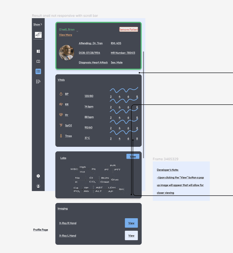
The original design of the project was for a Desktop App, however the client informed our team with 4 days remaining from the sprint that the size he was allotted for this software would be tablet sized. While the timing wasn't ideal, it was important to be adaptable and by having a growth mind set I was able to view this is an opportunity to design responsively.
